I was designing a pull-up info panel – the kind you slide up for more details. How do you make it clear to the user? How do you show it’s draggable?
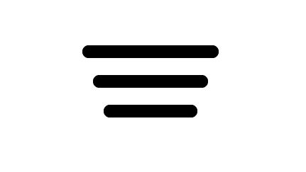
My first thought was this icon. Makes sense, right?
It works in the UI. But why this shape? It’s abstract. How does it convey “drag”? I’d never considered it before.
Then it hit me: it’s based on real-world objects. Think ridges or stripes – they increase friction, making things easier to grip and slide.
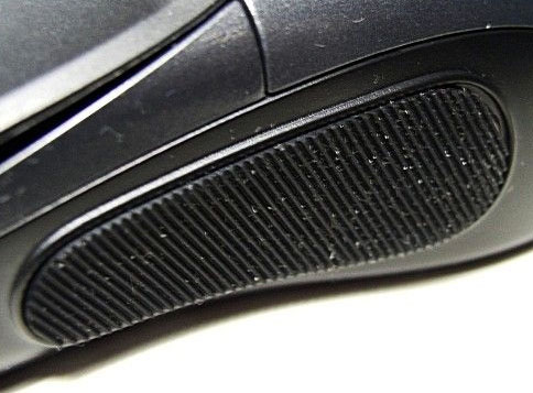
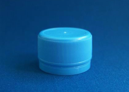
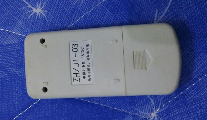
Mice, bottle caps, remote control backs… they all use it.
It clicked! Sometimes, you need the flat form, but the skeuomorphic spirit.