If you’re new to mobile design and development, you’ve likely struggled with dimensions. This guide breaks down the basics for beginners.
The Situation
Mobile screens come in many sizes. Fragmentation, especially on Android, is a challenge. You’ll encounter resolutions like 480x800, 480x854, 540x960, 720x1280, 1080x1920, and even 2K screens. iPhones have joined the fragmentation party: 640x960, 640x1136, 750x1334, 1242x2208.
Don’t panic. Most apps and sites display well across screens. There’s a method to the madness.
Pixel Density
Screens are made of tiny pixels. The resolutions mentioned above are the screen’s actual pixel dimensions. A 480x800 screen has 800 rows and 480 columns of pixels. Each pixel emits colored light to create images. However, a phone’s physical size doesn’t scale proportionally with its pixel dimensions. For example, the iPhone 3GS (320x480 pixels) and iPhone 4S (640x960 pixels) are both 3.5 inches, but the 4S has double the pixels.
This is where pixel density (PPI, or pixels per inch) comes in. It bridges the digital and physical worlds.

PPI is the number of pixels in one inch. An inch is a fixed length (2.54 cm). Higher PPI means a sharper display. Retina screens are clearer because their PPI is doubled.
Scaling and Logical Pixels
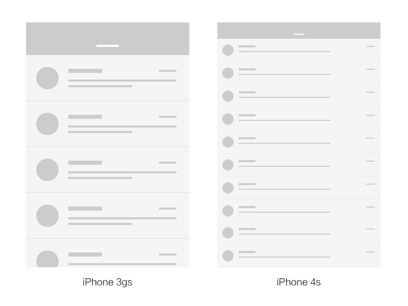
Consider the iPhone 3GS and 4S again. Imagine an email list. If designed like a PC webpage, the 3GS might show 4-5 rows, the 4S 9-10, with each row being very wide. But the phones are the same size! If displayed this way, content legible on the 3GS would be tiny on the 4S.
In reality, they look similar. Retina screens use 2x2 pixels to represent 1 pixel. A 44-pixel-high top bar on a regular screen uses 88 pixels on a Retina screen, making it appear twice as large, matching the 3GS’s appearance but with greater clarity.
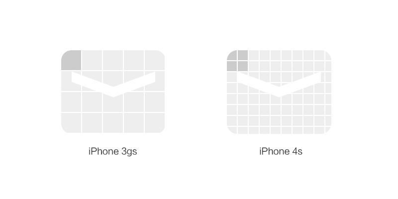
Older iOS apps often had “@2x” and non-"@2x" versions of images. iOS automatically chose the correct one; Android works similarly.
Apple used the regular screen as a baseline, with a 2x scaling factor for Retina screens (3x for iPhone 6 Plus). Dividing actual pixels by the scaling factor gives you logical pixel dimensions. Screens with the same logical pixels display content similarly.

Android’s approach is similar but more involved. Due to the wide range of Android screen sizes, Android groups devices by pixel density, assigning scaling factors to each group for visual consistency. iOS and Android handle PPI calculations for us.
Screens around 120 PPI are classified as ldpi, around 160 as mdpi, and so on. Scaling factors are:
- ldpi [0.75x]
- mdpi [1x]
- hdpi [1.5x]
- xhdpi [2x]
- xxhdpi [3x]
- xxxhdpi [4x]
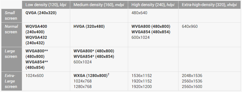
iPhone scaling factors are simpler. But with many Android phones, how do we categorize them? Here’s a table (Umeng data, Oct 2014 - Mar 2015):
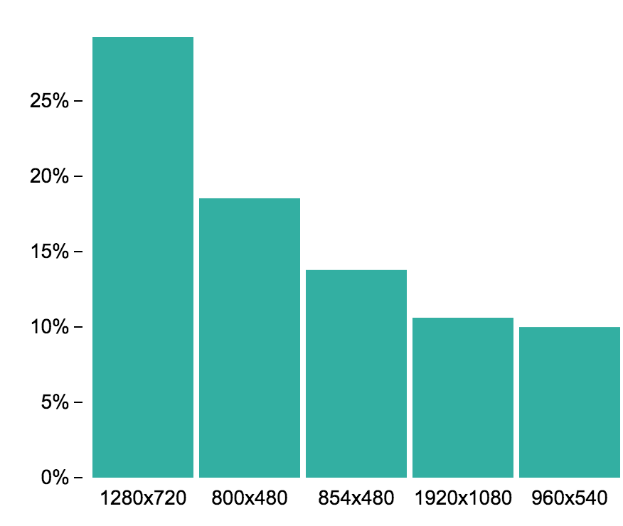
Based on the market then, we can categorize phone resolutions (this isn’t exhaustive, but was relevant for about a year):
- ldpi: Nearly extinct.
- mdpi [320x480]: (Under 5% market share; new phones won’t use this; screens are usually tiny).
- hdpi [480x800, 480x854, 540x960]: (Older/current low-end phones, screens around 3.5/4.7-5.0 inches).
- xhdpi [720x1280]: (Older mid-range/current low-to-mid-range phones, screens around 4.7-5.0/5.0-5.5 inches).
- xxhdpi [1080x1920]: (Older high-end/current mid-to-high-end phones, screens usually above 5.0 inches).
- xxxhdpi [1440x2560]: (A few 2K phones, e.g., Google Nexus 6).
mdpi (1x) is the baseline. Devices with different densities are multiplied by their scaling factor to achieve a similar visual effect.
However, Android logical pixel dimensions aren’t uniform. For example, 480x800 (hdpi) and 1080x1920 (xxhdpi) have logical dimensions of 320x533 and 360x640, respectively. The latter is wider and taller, displaying more. So, even with scaling, displays on various Android devices aren’t perfectly identical.
Units
Logical pixel dimensions determine how things look. iOS and Android use units for these: “pt” (points) for iOS, and “dp” (density-independent pixels) for Android. They’re essentially the same.
Conversion between units depends on the scaling factor:
- 1x: 1pt = 1dp = 1px (mdpi, iPhone 3GS)
- 1.5x: 1pt = 1dp = 1.5px (hdpi)
- 2x: 1pt = 1dp = 2px (xhdpi, iPhone 4S/5/6)
- 3x: 1pt = 1dp = 3px (xxhdpi, iPhone 6 Plus)
- 4x: 1pt = 1dp = 4px (xxxhdpi)
We should think in logical pixels. Some Android designers use 1080x1920 canvases, others 720x1280, leading to inconsistent UI element sizes. The minimum tappable area on Android is 48x48dp. On xhdpi, a button should be at least 96x96px; on xxhdpi, 144x144px.
Regardless of canvas size, design for the baseline, and developers need logical pixel dimensions. For clarity, use logical pixels in specs and discussions. Avoid saying, “The tab bar is 96 pixels high, designed for xhdpi.”
What about Web?
The absolute unit for mobile web is still “px” in code, but the principle is the same. Pixel density affects all apps, including browsers. Front-end tech can leverage this. One line of code lets the browser render the page using the app’s scaling method.
Use this test page http://greenzorro.github.io/demo/basic/响应式断点.html to check your device’s logical width.
The iPhone 5S (640x1136, scaling factor 2) is seen by the browser as 320x568 (baseline). Design and develop using logical pixels. You’ll need to prepare 2x images and scale them down to 1x in code for sharpness.
Practical Application
Here’s how to set up your canvas for iOS, Android, and Web. First, a Photoshop tip:
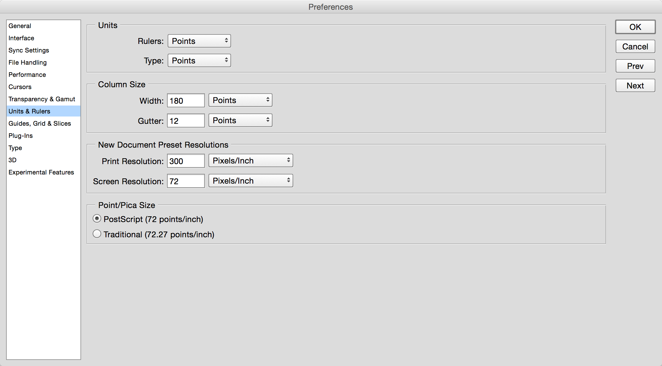
Think in logical pixels. In Photoshop, set “Units & Rulers” to “Points” (“pt”). Use this for iOS, Android, or Web. Remember platform-specific unit names (pt, dp).
Adjust scaling with DPI (actually PPI) in Image Size. Screen designs use 72 DPI; print uses 300. Why?
300 DPI relates to the human eye’s resolving power. More pixels per inch (DPI) means greater clarity. 300 DPI creates realism; 10 DPI would look like a mosaic.
72 DPI has historical roots. Early Macs had 72 DPI displays. Setting Photoshop to 72 DPI matched on-screen and print sizes. 72 DPI became a standard.
To adjust scaling: 72 DPI is 1x. 144 DPI (72 x 2) is a 2x scaling factor.
Canvas settings:
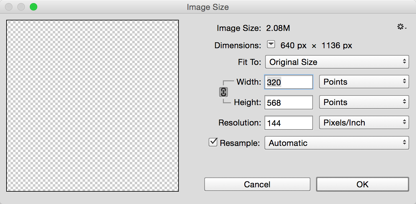
iPhone
iPhone sizes vary (in logical pixels). For one design covering all iPhones, choose a moderate size.
iPhone 5/5S (2x scaling, 320x568 logical pixels) is common. iPhone 6 (2x, 375x667) is gaining popularity.
Designing for either accommodates the 4S and doesn’t look too empty on the 6 Plus.
For the 6 Plus, 3x images are scaled from 2x, so ensure bitmaps stay sharp.
Android
Android fragmentation is manageable. Logical dimensions are more unified: 360x640. Choose a scaling factor. For xhdpi, DPI is 144 (72 x 2). For xxhdpi, it’s 216 (72 x 3).
Older 480px-width devices will show less content. Keep important content near the top/middle.
These devices are fading. Those in use are likely feature phones; user experience is less critical. It’s okay to disregard them.
Web
There’s no single standard. A common approach is designing for the iPhone 5 (2x, 320x568).
This is practical: 2x screens are common on iOS and Android, and it’s the smallest 2x size, leading to smaller images and faster loading. The downside: images might not be perfectly sharp on 3x devices.
For image quality over speed, design for the iPhone 6 Plus (3x, 414x736).
Conclusion
Mobile dimensions are more complex than PC, with scaling being key. But scaling brings different sizes to a common level, allowing one design to adapt. This makes it easier to understand.