This is about how I used Excel, data visualization, AI, statistics, and formulas to create a custom growth chart. I’ll explain everything clearly, even the basics.
Many parents use apps to track their baby’s height and weight. I only used that one feature. Installing a large app just for that felt wasteful. It was a perfect chance to use my Excel skills. It’s just data analysis, right? Excel can handle it!
System Planning
First, I needed a plan. Let’s see how growth curves work in parenting apps.

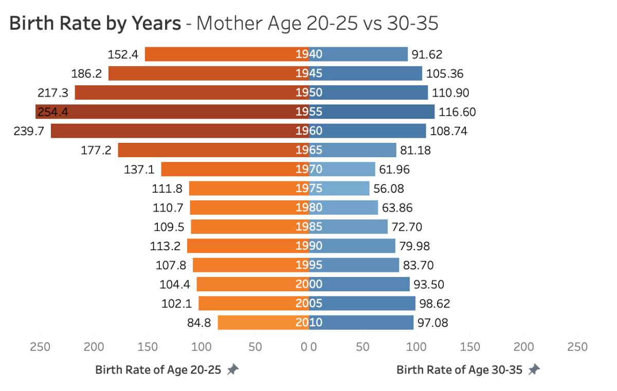
This is a growth curve from Baobaoshu (BabyTree). The 50% line is the median. If my baby’s height (or weight) is on this line, about half of babies are taller (or heavier) and half are shorter (or lighter). The 75% and 97% lines mean the height (or weight) exceeds 75% and 97% of babies of the same age. The 25% and 3% lines work similarly. This shows my baby’s growth compared to others.
I wanted a similar tool to:
- Record my baby’s height and weight.
- Query the normal height and weight range for each month.
- Show how much my baby’s measurements deviate from the norm.
A chart or curve didn’t matter. The key was the third point: calculating and displaying the deviation intuitively. A diverging bar chart seemed suitable:
This chart compares two data sets in the same dimension.
For one data set, it shows direction and distance from a benchmark, often for positive and negative values.
This was perfect. I’d use the median as the benchmark, showing if my daughter’s height (or weight) was above or below it. The bar length would show the deviation. To simplify, I used symbols: a minus for below, a plus for above, with more symbols meaning greater deviation. Seeing “+++” or “—-” would signal a need to check her growth trend.
Preparing the Data
With a goal, I started working. First, the first two capabilities:
- Record height and weight.
- Query normal ranges.
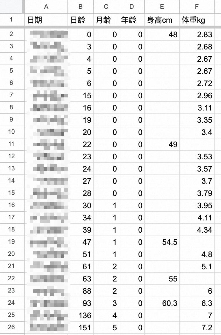
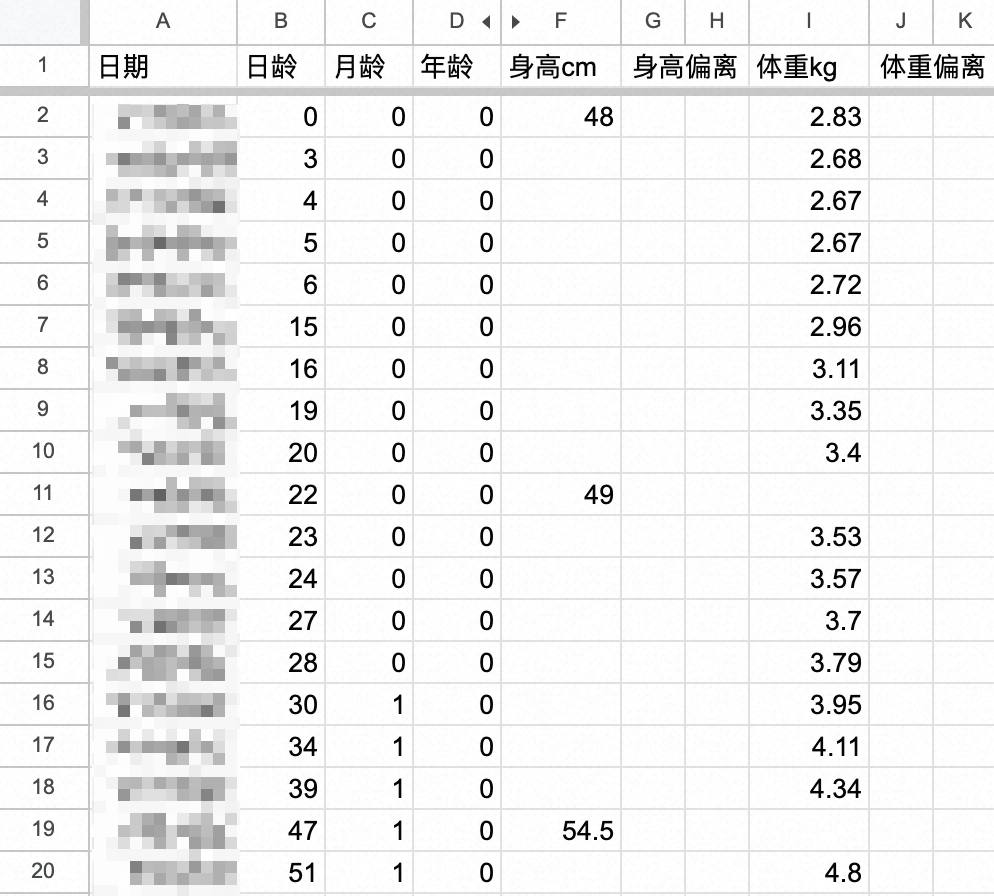
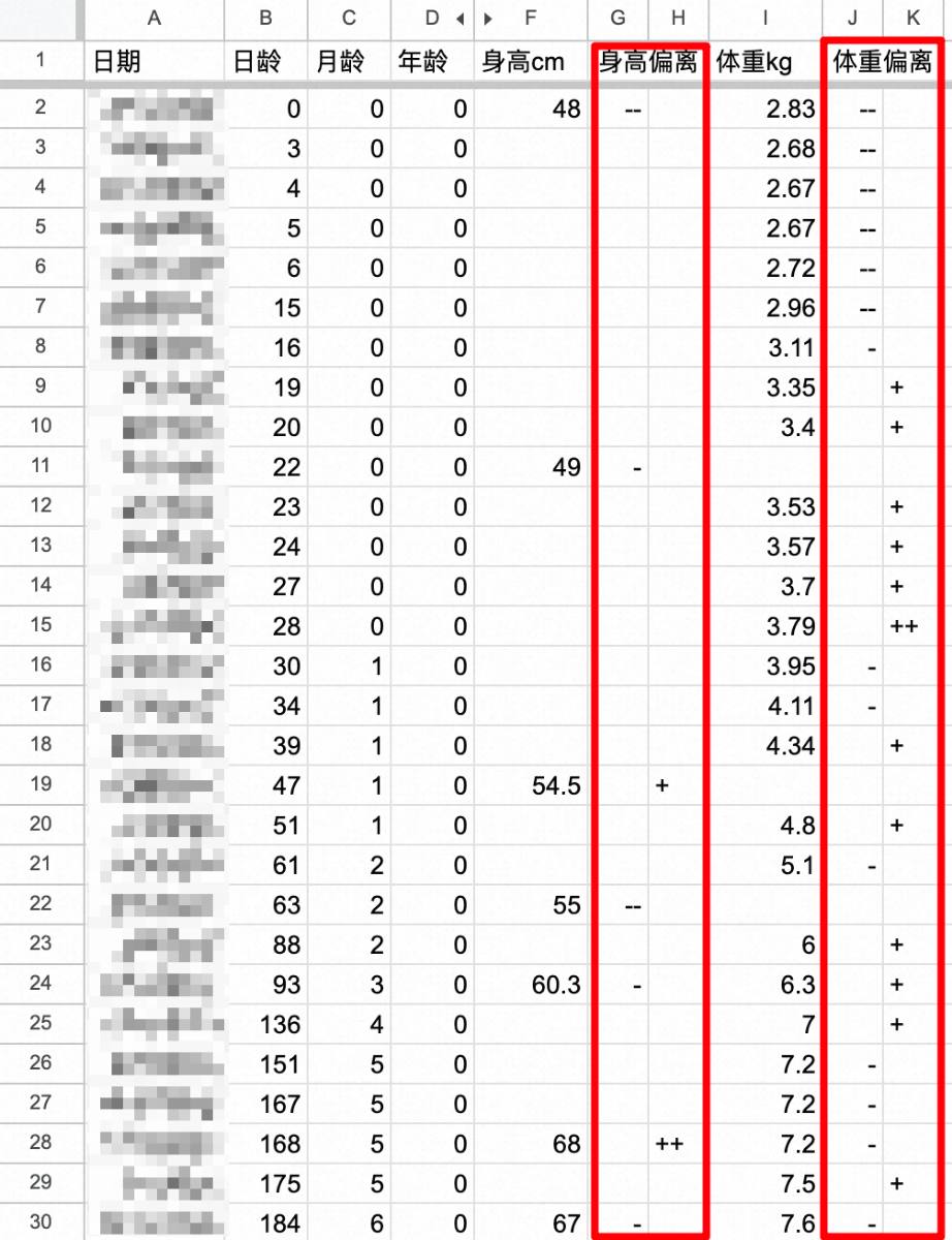
Baby’s Growth Data
My baby’s data was in the Baobaoshu app (dates are omitted to protect my daughter’s birthday):
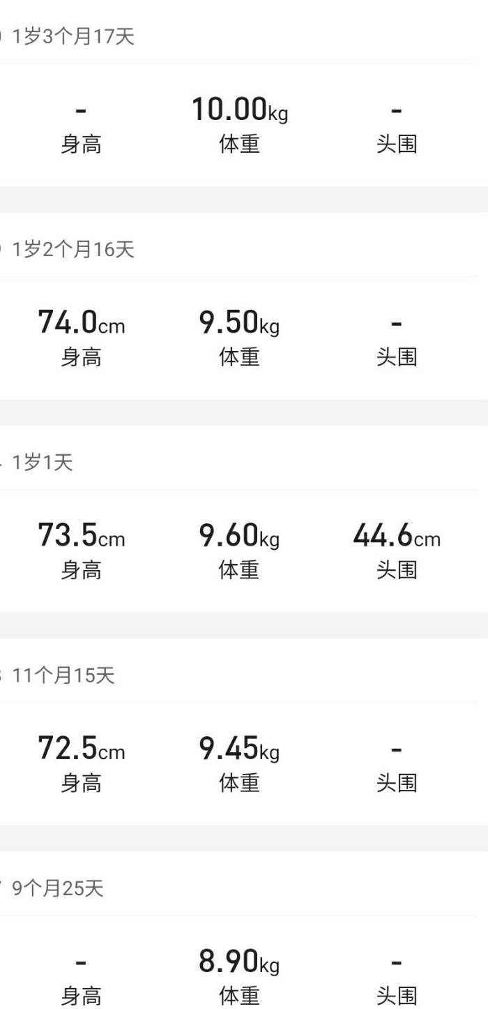
Baobaoshu doesn’t export data. Manual entry was an option, but there had to be a better way.

I took screenshots of the records and used an Android app, Screen Master, to stitch them into one long image.
Then, I used Baimiao OCR (https://web.baimiaoapp.com/) to extract the text:

The format was messy, but AI can handle that.

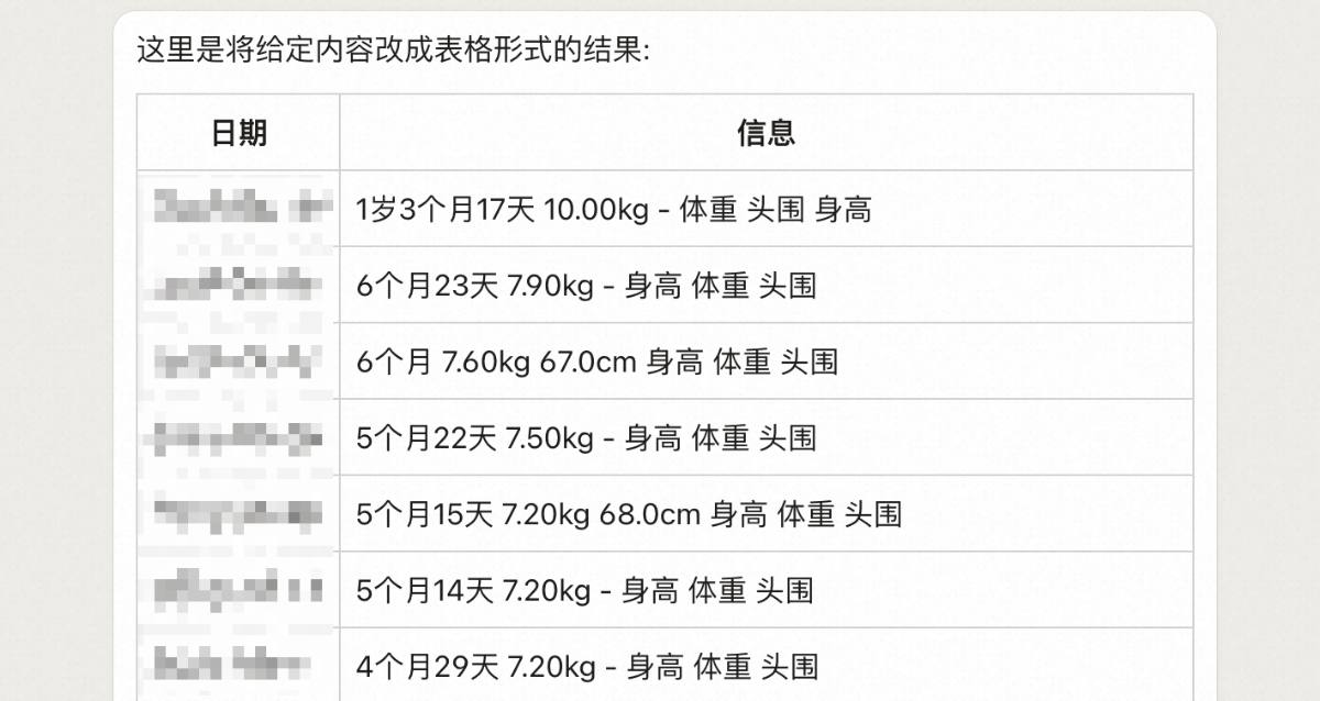


Done! I just copied it to Excel. Day age, month age, and age were automatically calculated by subtracting my daughter’s birthday from the recording date.
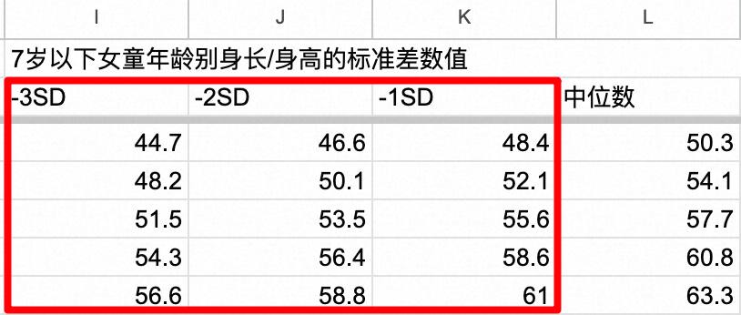
Normal Range Standards
Reference values are on the National Health Commission’s website. The 2022 standard, WS/T 423—2022, is the same source as Baobaoshu: http://www.nhc.gov.cn/fzs/s7848/202211/8b94606198e8457dafb3f8355135f1a3/files/e38068f0a62d4a1eb1bd451414444ec1.pdf
The data was in this format:
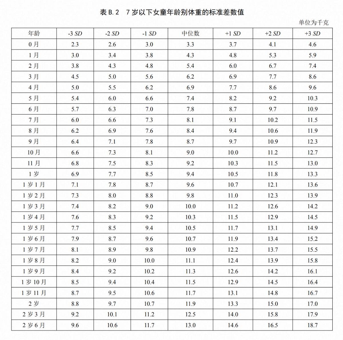
I’ll explain this table. We’ve covered the median. The key is “SD,” or Standard Deviation. It’s a basic statistical term. First, we need to understand normal distribution. The Health Commission’s statistics use a large sample size, measuring many children. Height and weight are random and, with a large enough sample, normally distributed around the average (or median, which is very close). A normal distribution looks like this:
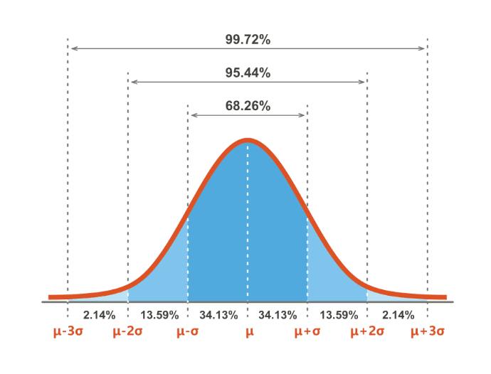
The horizontal axis is height (or weight), and the vertical axis is the number of children. The center dashed line is the median. Most children are near the median. Fewer children are at the extremes.
Standard deviation is the distance between the dashed lines, which are equally spaced. It’s like a ruler for the normal distribution. It tells us the proportion of data within a range. For example, 68% of children are within one standard deviation above and below the median; 95% are within two.
Standard deviation is a key property of normal distribution. Proportions for 1, 2, and 3 standard deviations are always 68%, 95%, and 99.7%. Knowing the average (or median) and standard deviation lets us find any data point’s position.
I copied the table to Excel and converted all ages to months:
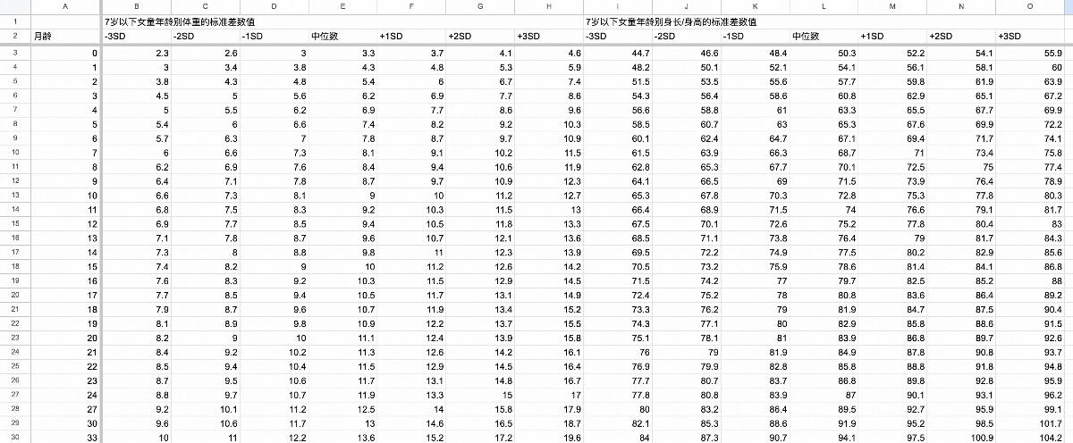
The table shows the median and values at 1, 2, and 3 standard deviations above and below it. This helps me see where my daughter’s measurements fall and how much they deviate.
Drawing the Curve
Now, the hard part: showing how much my baby’s measurements deviate from the normal range. This requires real Excel skills.
I had two tables: my baby’s data and the reference ranges. I needed to add deviation columns, query the reference table, calculate the deviation, and show it with plus and minus signs. Minuses would be right-aligned in the left column, and pluses left-aligned in the right, creating a simplified diverging bar chart.
Matching the Reference Month
In theory, this is simple: use VLOOKUP to match the month, then nested IFs to compare and output symbols.
But the National Health Commission table has gaps:

From 2 years old, data is provided every 3 months. This is reasonable, as growth slows. But it affects querying. At 25 months, a direct VLOOKUP finds nothing.
One workaround is to manually complete the reference table, adding missing months and using values from younger months (e.g., using 24-month values for 25 and 26 months).
But I wanted intelligent matching!
So, I added a hidden column to find the corresponding reference month for each row.
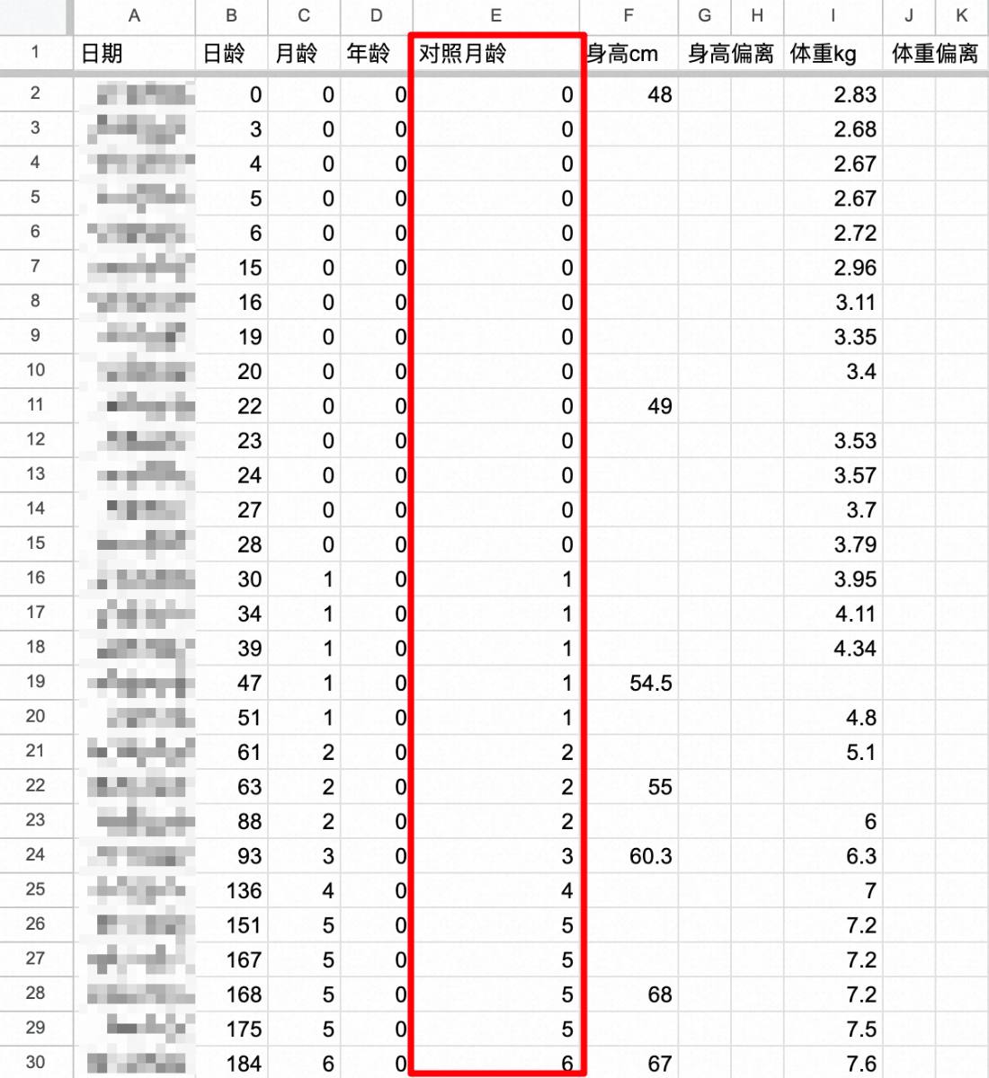
The formula for this column is:
=IF(ISBLANK(A2),"",INDEX('生长对照表'!A$3:A$46,COUNTIFS('生长对照表'!A$3:A$46,"<="&C2),0))
In plain English, the formula checks if the date is blank. If so, the cell is empty. Otherwise, it counts rows in the reference table with months less than or equal to the baby’s age, effectively “matching down.”
Before two years, the baby’s age matches the reference age. I tested this; a 25-month record will match the 24-month reference.

Calculating Deviation
The reference month column handles mismatches, so we can calculate deviations.
The “height below average” column formula serves as an example:
=IF(ISBLANK(F2),"",IF(F2>VLOOKUP(E2,'生长对照表'!A$3:O$46,12),"",IF(F2=VLOOKUP(E2,'生长对照表'!A$3:O$46,12),"=",REPT("-",5-RANK(F2,{F2,VLOOKUP(E2,'生长对照表'!A$3:O$46,11),VLOOKUP(E2,'生长对照表'!A$3:O$46,10),VLOOKUP(E2,'生长对照表'!A$3:O$46,9)},1)))))
Okay, this formula looks insane. Let’s break it down, layer by layer, starting from the outside:
Layer 1
=IF(ISBLANK(F2),"",IF(F2>VLOOKUP(E2,'生长对照表'!A$3:O$46,12),"",IF(F2=VLOOKUP(E2,'生长对照表'!A$3:O$46,12),"=",Layer 2)))
This part first checks if the height column (F2) is empty. If so, this cell is also empty. Otherwise, it compares F2 with the corresponding median height from the reference table. If F2 is greater than the median, the cell remains blank (as this column only shows negative deviations). If F2 equals the median, it displays “=”. If F2 is less than the median, the second layer calculates the number of “-” signs to output.
Layer 2
REPT("-",Layer 3)
I initially planned to use nested IF statements to determine the number of minus signs, but that seemed a bit silly. Here’s a simpler approach: The REPT function can repeat a string a specified number of times. Now, the problem is passed to the third layer: calculating the number of minus signs to output.
Layer 3
5-RANK(F2,{F2,VLOOKUP(E2,'生长对照表'!A$3:O$46,11),VLOOKUP(E2,'生长对照表'!A$3:O$46,10),VLOOKUP(E2,'生长对照表'!A$3:O$46,9)},1)
Here’s a hidden gem in Excel: array constants. We often use ranges in formulas, which are implicitly arrays. But did you know you can create arrays manually, like in programming, using curly braces {}? For instance, {1,2,3,4} in a formula is the same as:
Array constants are far more flexible. You can combine seemingly unrelated data. Just look at what’s inside the {}:
{F2,VLOOKUP(E2,'生长对照表'!A$3:O$46,11),VLOOKUP(E2,'生长对照表'!A$3:O$46,10),VLOOKUP(E2,'生长对照表'!A$3:O$46,9)}
This array combines my baby’s height (F2) with the heights at -1, -2, and -3 standard deviations from the mean.
RANK(F2,Array,1)
Next, RANK sorts my baby’s height among those four values, ascending. Subtracting the rank from 5 gives the number of minus signs. Why 5? Think it through based on different scenarios, and it’ll become clear.
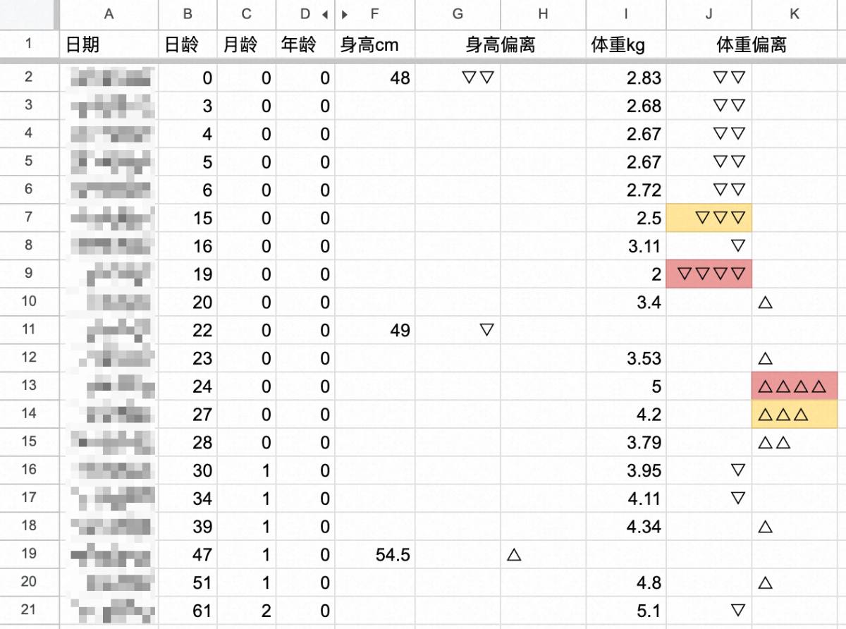
I used a similar approach for the other three deviation columns. It works perfectly. The number of symbols indicates the standard deviation range. 95% of children fall within two standard deviations, so two symbols are fine. All good so far!
Data Visualization
For data visualization, I need to highlight key data. The plus and minus signs are basic.
I don’t need fancy graphics. To flag outliers, I just replaced the pluses and minuses with distinct symbols and added simple conditional formatting for background colors. That’s enough for me.

Three symbols mean the measurements are outside the 95% range – I use yellow. Four symbols mean outside 99.7% – I use red. I manually adjusted a few extreme values for demonstration:
Wrap-up
Finished! Time to uninstall that parenting app. I happily clicked the “x”.
There are many growth trackers, but building my own is uniquely satisfying. I learned about arrays, REPT, and RANK on the fly – a great experience. The initial planning was the most interesting. Once started, it took just an hour.
It shows the power of combining knowledge, tools, and techniques. Improvise, adapt, overcome.
I should mention I prefer Google Sheets. Replicating this in Excel might require tweaks, but the formulas are similar.
[2024.1.18 Update]
I’ve received requests for the spreadsheet. Converting to Excel had issues: Excel doesn’t support array constants as a RANK range, and you can’t reference other cells within them. Doing this in Excel is harder, likely needing many nested IFs. I recommend Feishu sheets or Google Sheets.
I’ve made boy/girl versions available.
Boy version: https://qvokpfxqsh.feishu.cn/wiki/JlMKw1NiBis8yok62BJcbCZ3n2d
Girl version: https://qvokpfxqsh.feishu.cn/wiki/RKHuwkXafiS987kLxPIc8jkxnAc