The Story
I recently had a major clash with colleagues in a group chat. Things got heated.
I’m a designer, though you wouldn’t know it from my posts. I mostly do UI and interaction design, but I also handle data reports and PPTs. Sometimes, I even code and build websites. Our design department acts as a central hub, fielding requests from other departments. I’m juggling four projects, two of which are UI projects only I can handle. My schedule’s packed.
Why the fight? My UI work was fully booked, but another department insisted I help optimize a data report (a consumer report on jewelry). It wasn’t even advanced data viz, just finding and swapping product images in a PPT, showing it to the client, and swapping them again if they weren’t happy.
I refused. It’s intern-level work. I’d help if I had the time, but it wasn’t jumping the queue. I stood firm. They argued that since I’d done it before, I should continue, and the client was pushing. We went at it.
They ended up finding another designer. Afterward, my manager asked me to share my scheduling method. It seemed like they’d complained, but I was booked solid. A company has limited liability; an employee shouldn’t have unlimited responsibility, right?
For now, they can’t do much. But to cover my bases, in case they went to the boss, I had a backup plan. I used my work schedule data to calculate time spent on each task, assessed each task’s value, and created some charts. The monetary values indicate the salary range of a designer capable of that work.
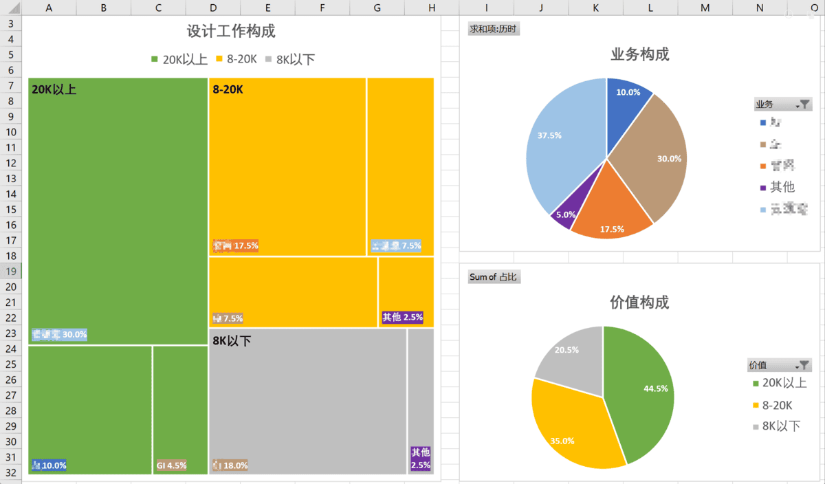
It’s clear: their department (in brown) has a huge chunk of low-value work – finding and replacing images, adjusting alignment and fonts – and it takes up a ton of my time. The boss cares about cost-effectiveness. Having someone with a 20K+ salary doing intern work? Who knows who’d get chewed out.
The fight’s over, and I won’t dwell on it. But the data handling and analysis were interesting, so I’m documenting it.
Data Source
This analysis was possible because I regularly collect data. I organize anything I consider data in a way that’s useful later.

I created a design schedule with a multi-dimensional table tool. I set the default view to a calendar and put it in my DingTalk signature, so anyone requesting work could see my availability.
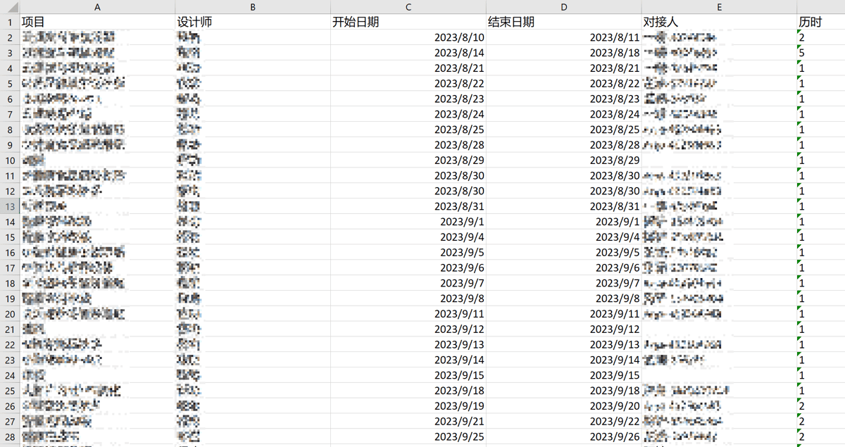
Although I add work items in the calendar view, it’s a data table. For easy recording, I kept the fields simple: project name, designer (it’s for the whole team), start and end dates, requester, and duration (in days), which is calculated automatically.
When a new project comes in, I update the schedule immediately. To avoid conflicts, I’m motivated to maintain this data table.

The raw data was ready, containing 40 workdays (nearly 2 months of data). I exported it to Excel, changed the duration from text to numbers, and started a series of analyses (from right to left) to generate the charts.
Time Analysis
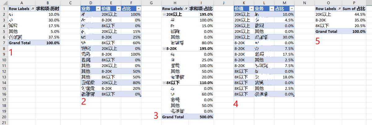
First, time analysis. This tab has two tables:
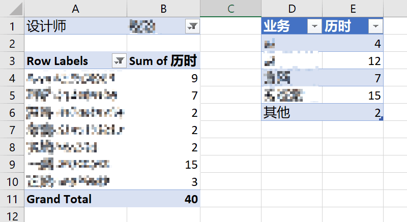
- The left table pivots the raw data, showing time spent on each requester.
- The right table maps each requester to major business lines, summarizing the time each line takes up.
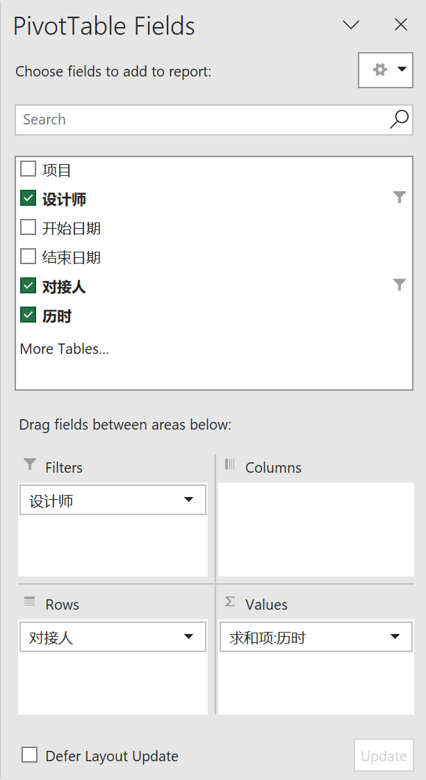
The left pivot table: filter for a specific designer (me), list each requester as a row, and sum the durations.
The right table lists the major business lines, selects corresponding requesters from the left table, and sums the totals.

Selecting data from a pivot table is easier. Excel automatically writes the GETPIVOTDATA function; you just click, avoiding SUMIFS.
Value Analysis
Next, I analyzed how well my time was spent.
The Value Analysis tab has five tables:
- Table 1 is the reshaped right table from Time Analysis.
- Table 2 shows the percentage of each business line’s work in different value ranges (manually created).
- Table 3 pivots Table 2 for easier use in Table 4.
- Table 4 multiplies Table 1 and Table 3 to calculate the actual percentage of each work type in different value ranges.
- Table 5 pivots Table 4, summarizing the total percentage of work in different value ranges.
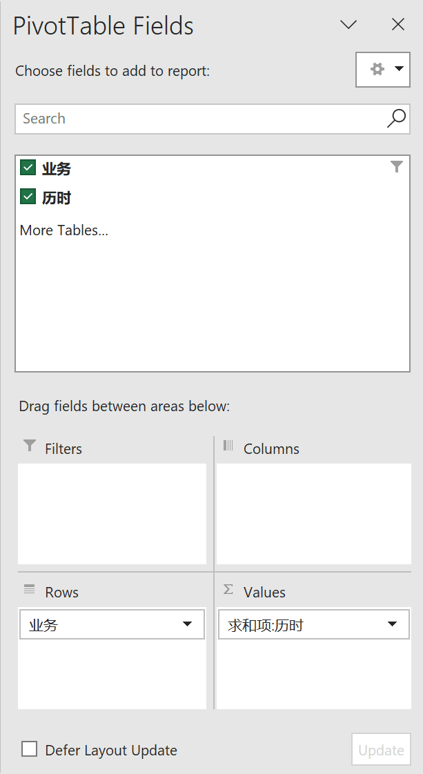
Table 1: each business line is a row, and durations are summed.

The key is the format. In “Sum of Duration” settings, I changed “Show Values As” to “Percentage of Column Total” and the number format to percentage, getting each business line’s time percentage.
Table 2 is the core, but it’s subjective. It’s not super rigorous, but good enough for arguments and review. I tried to be fair, assigning value percentages to each business line based on experience. I swear I didn’t intentionally undervalue the other department; their vendor-like nature means their low-value work proportion is high. The designer salary ranges for the value tiers are based on my 10+ years of experience.
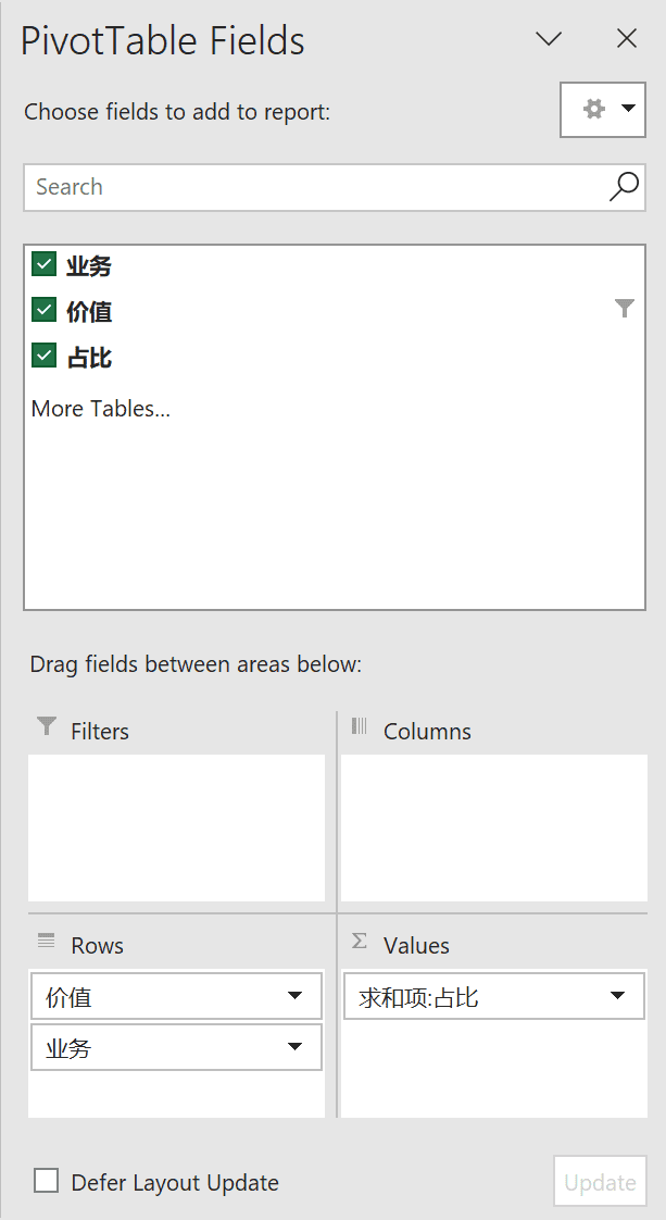
Table 3 pivots Table 2. It’s divided by value, then by business line. This structure is for Table 4, for easier viewing and data retrieval.
Table 4: multiply data from Tables 1 and 3.
Table 5 pivots Table 4, summarizing by value.
Charts
With the analysis done, it’s time for visuals.
Level 1: Show percentages of each business line and value range, using data from Tables 1 and 5. Create pie charts, add data labels, and adjust colors.
Level 2: Show the breakdown of business lines within each value range. Treemaps are best for this two-level hierarchical proportion data. Create a Treemap from Table 4, and adjust background and label colors to match the two charts on the right.
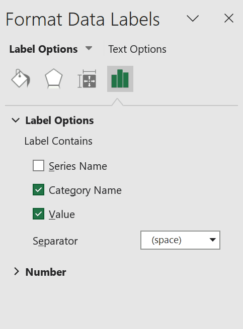
Enable Treemap labels to show names and values, displaying each business line’s detailed percentage.
Afterword
With this value analysis system, I just maintain the schedule. I import the data, update a few pivot tables, and the charts are generated automatically.
Even with limited raw data, there’s more to analyze: monthly workload saturation, average project cycle for each business line, and value composition fluctuation over a year.
The fight’s over, and I won’t bring this up to the boss, but it’s interesting that design work can be analyzed with data.