“When designing a UI for this screen, how big should I make my canvas?”
Background
After my wife switched from UI to industrial design, she started running into all sorts of weird screen sizes. With her UI background, she was also tasked with designing interfaces for various industrial control machines. These screens often left her stumped, with no idea how large to make her design canvas.
This is a common headache. Many UI designers don’t fully grasp the technical principles of screen displays. The problem became more widespread with the advent of Retina displays and their “pixel density” concept, leaving many designers guessing about the correct canvas dimensions.
This isn’t an issue for common devices, as design tools like Figma and Sketch provide presets. But in niche areas like industrial design, smart homes, and IoT, you’ll find a bewildering array of screen sizes. UI designers used to standard web and mobile projects are often stumped when they encounter these custom displays.
Fortunately, there’s a method to the madness. The key is PPI (Pixels Per Inch), which acts as a bridge between physical dimensions and the pixel grid. You might also hear it called “pixel density”—a fitting term. Higher density means less pixelation and a sharper image.
Plenty of articles dive deep into the technical details. But honestly, a UI designer shouldn’t need a degree in display engineering to do their job. In today’s specialized world, an artist doesn’t need to know how their canvas is woven.
So, what designers really need isn’t a textbook, but a simple calculator. Input the screen specs, get the right canvas size. Simple.
The Calculation
To build this simple tool, I had to break down the math. The calculator needs a few inputs from the user:
- Pixel width of the screen
- Pixel height of the screen
- Diagonal screen size in inches
- Typical viewing distance (e.g., Touch, Desktop, TV)
- Preferred design scale (based on common widths like 375px for @1x, 750px for @2x, etc.)
With the pixel width and height, we use the Pythagorean theorem to find the diagonal pixel count. Divide that by the screen’s diagonal inch measurement, and you get the PPI.
PPI = Diagonal pixels / Screen size = √(Pixel width^2 + Pixel height^2) / Screen size
Next, we estimate the screen’s density multiplier (@1x, @2x, etc.). This is done by dividing the PPI by a constant that varies with viewing distance. While real-world multipliers can be fractional, design conventions round them to the nearest integer. It’s the standard way to handle screen fragmentation.
Screen Multiplier = PPI / Divisor
The magic numbers are: 150 for close-up (touch) screens, 110 for mid-range (desktops), and 40 for far-away (TVs).
Where did these numbers come from? I reverse-engineered them by analyzing data from a wide range of devices. I noticed that for most touchscreens, if you divide their PPI by their native scale factor, the result hovers around 150. The same pattern emerged for mid-range and far-range screens, with values around 110 and 40.
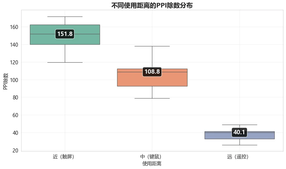
You’ve probably not seen a chart like this often. It’s a box plot, and it’s great for showing the distribution of data. You can’t whip this up in Excel; I had to use Python to generate it.
If you’ve ever looked at stock charts, this might look familiar, like a candlestick chart. The concept is similar, with four key points:
- Top of the thin line: Maximum value (highest price)
- Bottom of the thin line: Minimum value (lowest price)
- Top of the thick box: Third quartile (opening/closing price)
- Bottom of the thick box: First quartile (closing/opening price)
The box plot has one extra feature: a line inside the box representing the median. I used the median value for each category as my divisor.
A quick stats refresher: the median is the middle value in a sorted dataset. The first and third quartiles are the medians of the lower and upper halves of the data.
Why use the median instead of the average? The long “whiskers” on the plot show that there are outliers that would skew the average. The median gives a better sense of the central tendency, which is what we need to represent a typical device.
Okay, back to the formula:
Screen Multiplier = PPI / Divisor
So, we have the PPI and the right divisor. This gives us the screen’s scale multiplier, which is the key piece of the puzzle. The final step is to account for the designer’s workflow. Some prefer designing at @1x (common in Figma/Sketch), while others work at @2x or @3x (a holdover from Photoshop-centric days).
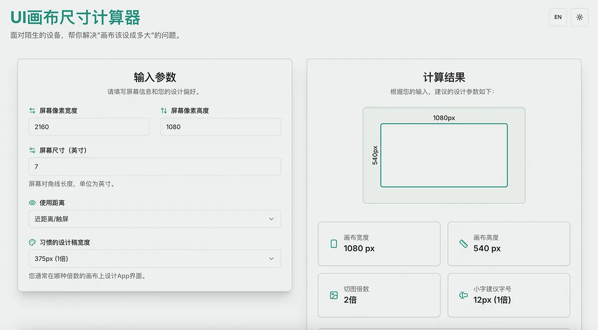
We take the screen’s native resolution, divide by its scale multiplier to get the logical resolution (@1x). Then we multiply that by the designer’s preferred scale factor (@1x, @2x, or @3x) to get the final canvas dimensions.
Canvas Width = (Screen Pixel Width / Screen Multiplier) × Design Canvas Multiplier Canvas Height = (Screen Pixel Height / Screen Multiplier) × Design Canvas Multiplier
This also helps answer two related questions: what scale should assets be exported at, and what font sizes are appropriate?
Asset Export Scale = Screen Multiplier / Design Canvas Multiplier
For example, if the target screen is @2x and you design on a @1x canvas, you’ll need to export @2x assets. If you design on a @2x canvas, you’ll export @1x assets.
There’s one catch: your design scale can’t be higher than the target screen’s scale. It makes no sense to design at @3x for a @2x screen. In that case, you should just match the screen’s scale.
Font sizes scale directly with your design canvas. A 12px font on a @1x canvas becomes 24px on a @2x canvas. The same rule applies: don’t use a design scale larger than the target screen’s scale.
Is your head spinning from all the math? That’s exactly why I built this tool. Designers shouldn’t have to waste time on this stuff. A simple calculator can save everyone hours of headache.
I first built a proof-of-concept in Excel to validate my formulas. But it was clunky and not something I could share widely. So I decided to turn it into a proper web app. Since I’d already specced out the logic in detail, I figured I could hand it off to an AI to code. It should be a piece of cake, right?
Next, it was the AI’s turn to do the work. Using the logic and context above, I gave the AI the following prompt to generate a web tool:
The Task
- Product name: “UI Canvas Size Calculator”.
- Make it responsive for desktop and mobile.
- Use vanilla HTML, CSS, and JS. No backend, no heavy frameworks.
- Keep CSS and JS in separate files for maintainability.
- Write modular JS with constants defined at the top.
- Include robust form validation with helpful error messages and placeholder examples in the input fields.
- The results should show: Canvas Width, Canvas Height, Asset Export Scale, and Suggested Font Size (e.g., 12px for @1x, 24px for @2x, etc.).
- Display the results visually. Instead of just text, draw a simple diagram of a screen and label it with the calculated dimensions.
- Add a light/dark mode toggle, defaulting to light.
- Use #2A9D8F for the primary brand color.
The Result
And what do you know, it nailed it on the first try!
Well, almost. It ignored my request for vanilla JS and went with a full-blown Next.js, TypeScript, and Tailwind CSS stack. As a front-end dinosaur who started in the IE6 days, that stack was a bit intimidating.
I didn’t even know how to run it locally at first. But a few questions to the AI got me up to speed. I ended up getting a crash course in modern web development, and deployment turned out to be surprisingly easy.
And just like that, the app was live: https://ui-size.victor42.work/
It seems like a great new workflow for simple tools: write the blog post first, and the post itself becomes the spec for building the tool.
As a final check, I had the AI plug the screen data I’d collected into the new tool. The results were spot-on, especially for touch and desktop devices. The only place it stumbled was with large TVs and monitors, as many of them use a non-integer scale factor like 1.5x, which my simple model doesn’t account for.
But for its main purpose—calculating sizes for niche industrial design screens—it works like a charm.